

FlyBetter.org strives to be transparent without being overwhelming. This page is for those of you who want to know the details of where our numbers come from and what they mean. There are many topics. We've tried to order them from more significant to more esoteric.
Why are FlyBetter's CO2e numbers roughly double Google Flights.

Unfortunately the warming impact of flights is not just limited to the emissions of the aircraft. Persistent aircraft contrails (the long thin clouds aircraft leave behind) can have very significant warming effects. Especially at night these clouds produced by aircraft trap heat. The amount of this contrail warming potential can vary significantly and can even depend on atmospheric conditions.
You can read why the Travel Impact Model that Google Flights uses has chosen to leave contrail warming out of their emissions here.
Because FlyBetter compares ground transportation with flying, we have to at least approximately include this contrail warming effect. If we don't, our comparisons would be very skewed towards flying. A standard method of including this effect is to multiply the base CO2e number calculated by burning key fuel by a factor. We are using a relatively modest warming factor of 2.0. This means that if a flight is modeled to have released 100 kgs of CO2e greenhouse gasses for a particular itinerary, the warming effect of that trip becomes 200 kgs of CO2e once the additional contrail warming is added in. This figure comes from the Sustainability Indicator Management & Analysis Platform (SIMAP). We have chosen to use something close to the 1.9 factor used by DEFRA rather than the higher 2.7 factor from the IPCC.
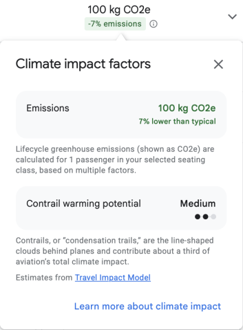
If you want to add another deeper layer to your flying green credentials, you can pay attention to this Google Flights information box and choose flights with lower contrail warming potential. The organization Blue-Lines is working on reducing this source of warming.
What exactly do the "Travel Modes" map to?
To keep the site simple we have chosen a couple of canonical types of travel. The table below summarizes what each of the travel modes means.
| Travel Mode | Description |
|---|---|
| Average Jet | Boeing 737 for ranges up to 3000 Nautical Miles Boeing 747 for ranges from 3000 to 7500 Nautical Miles |
| Modern Jet (efficient) | Boeing 737-Max for ranges up to 3000 Nautical Miles Boeing 787 for ranges from 3000 to 8000 Nautical Miles |
| Regional Jet (inefficient) | Embraer E170 Valid up to a range of 2000 Nautical Miles |
| Average Car | 25 mpg (eg Suburu Forester) |
| Efficient Car | 40 mpg (eg Toyota Prius V) |
| Inefficient Car | 16 mpg (eg Toyota Sequoia) |
Why haven't you included electric cars?
We do plan on including electric cars in the future, but unfortunately their warming effects are difficult to include in our current relatively simple warming model.
Typically the warming impact of driving an electric vehicle is lower than driving a gas powered vehicle, but it is still quite substantial. The challenge of modeling electric vehicles is that a substantial portion of their lifetime warming impact occurs at the time of manufacture (known as embodied carbon) and less impact occurs during their operation. To create a valid equivalency between electric and gasoline powered vehicles we would have to model the warming impact of their manufacture. And then if we created a more sophisticated vehicle warming model that includes manufacture we would also then have to model the warming impact of the construction of aircraft. We are currently not up to that level of modeling complexity.
So what is your current model?
We believe Google's Travalyst impact model to be quite good in most aspects. We mainly follow this model using the following simplifications
- We limit the choice of aircraft to a couple of distinct types as listed above.
- We don't customize loading and load factor (ie how full a flight is) to the specific flight. Instead a user can customize this.
- We aren't sophisticated enough to vary the cargo mass fraction per flight. Instead we fix it at 0.085.
- Instead of using seating class factors from IATA RP 1726, we use specific seat configurations from seatmaps.com. (Listed below.)
As described in the first section, we added radiative forcing to our model to allow for better comparisons between flying and driving.
Seatmaps.com links used in our model
The particular seat maps we use are listed below.
| seatmaps.com British Airways Boeing 787-9 |
| seatmaps.com United Embraer E170 |
| seatmaps.com Lufthansa Boeing 747-8 |
| seatmaps.com United Boeing 737-800 |
| seatmaps.com United Boeing 737-Max-8 |
Gory Details
If you really want to know the gory details, here is a link to a Google Sheets document that details examples of specific calculations. If you've gotten this far and find a concern with any of the numbers we've run, then you should really consider joining our team and contributing.
https://docs.google.com/spreadsheets/d/185VOJb0lPOiUns4S-6K8QGSSzSxd-wwZ7V6kC_I_WIs/edit?usp=sharing